We are the data generation
Almost everything we do is generating data; it’s an accepted part of our existence that we leave trails of data behind us like snail trails across a path. And at work we’re producing even more data—it’s everywhere. All our systems are collecting data.
And data is great – it’s what our future AI systems will be built on.
We have so much data we can't even see it anymore
But too much data is also a problem. For example, here is some data generated by someone bashing away at their keyboard with their fingers:
A l a s j d f h p k h g k j h v I p h a ; k j f j a h j I a s f I
a j d h a o s j d h f a s ; k j g h o a s h d f k j a v u a v u o
e h a o s e h o h e o t a ; k s d g t a k e u g t t r g e u a o ;
c u h c ; k j h f o u d k u ; a h f e o u ; g u e s a g a u f h a
e u g f a o u ; v h ; a u h j g h u f h a g a s . f h j c x b j h
g h j k h r k t h s ; g h ; j l a s d h g ; a s l d g I f o d g j
h ; l a r t I o ;
It's essentially meaningless as it is, without any processing or context. And that's a problem with humans: we're great at producing data, we're great at storing it, but we're not fabulous at processing it and finding useful patterns or meaning.
So we organise data to make it digestible
The above data presented in an Excel table—207 lines of letters and punctuation in a single column—would make it more digestible, but it's not much more useful than the data above.
And we visualise it to make it usable
Importing the Excel table in to Power BI changed the game. Power BI was able to aggregate the data, counting each entry, and sort it.
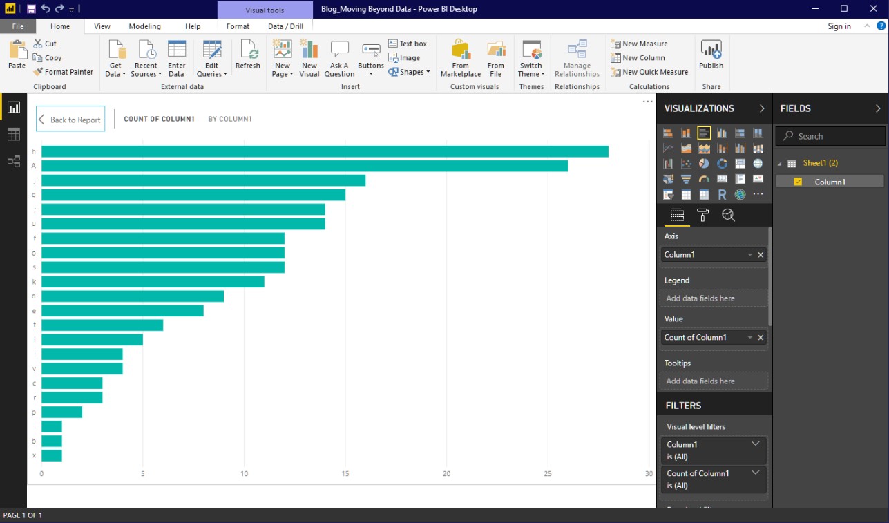
Power BI graphed the keyboard bashing data.
Meaning is already starting to emerge. The most frequently typed characters are “h” and “A” (“A” and “a” have been counted together). Knowing that the typist is a touch-typist, we can deduce that they were favouring their left side a little while bashing. Also, in the leader table are “J”, “g”, “:”and “u” suggesting that the typist was favouring the fingers on the edges of their hands—probably tipping their hands from side to side in an effort to spread the bashing across more keys.
The meaning we make from this data probably isn’t going to progress global thinking very far, but it does show how powerful it is to visualise data, and how identifying and observing patterns through visualisation can tell us things that we didn’t expect to see.
Imagine the power of visualising YOUR data
The visualisation above was relatively simple and based on simple data. Imagine the power of combining Power BI with multiple data sources from your organisation, or across big, complicated, and heavily populated tables.
Imagine crunching the numbers in your CRM, or even Google Analytics.
Imagine crunching numbers from your CRM WITH Google Analytics!
Even better – how about visualising in real-time, or semi-real-time?
With the right bells and whistles attached, Power BI can visualise your data in real-time, or semi-real-time where it updates automatically at intervals throughout the day.
Having mentioned real-time data, it is not always as useful as you think it may be; often semi-real-time is more effective. In a fast-moving environment, so much data can be changing at once that you can’t get a fix on what is actually happening. It’s like standing on a railway station trying to count the windows on a passing train; sometimes it’s easier to wait until it stops for a minute or two.
When a consultant may help
Having dangled the prospect of rapidly refreshing data in front of you, it is probably worth mentioning that most organisations use a consultant to build that part of their system. It’s relatively easy to connect Power BI to data sources and to create the views of the data that you want to see. But if you need custom elements like scripts to refresh data or interfaces with the few data sources that Power BI doesn’t natively connect to, investing some money in a consultant will probably save you in the long-run. A consultant can also assist in correctly modelling the data so that multiple reports can be consolidated in to a single Power BI report. If you do it yourself you’ll just be investing your organisation’s resources in developing a capability that is unlikely to be used very often after the job is done.
How to get started
Seeing the potential of visualisation, and knowing what data you have, can sometimes get in the way of starting on this journey—the sheer magnitude of the task can seem insurmountable.
Instead, start your journey this way: push back from your desk, close your eyes and think about what you want to see in front of you to understand your business. That vision is your starting point. Scribble it down on a scrap of paper and look at it. That is your beginning.
How do I find out more?
Click here to learn more about Power BI.