
The dreaded swing diagram
If you have spent any time trying to implement IT projects someone will have shown you one of the many variations of the infamous swing diagram. It shows what the user wanted—a simple tyre swing hanging from a tree—compared to what marketing suggested, management approved, engineering designed, manufacturing produced, and maintenance installed, none of which are quite the customer’s ideal of a tyre, on a rope, hanging from a branch.
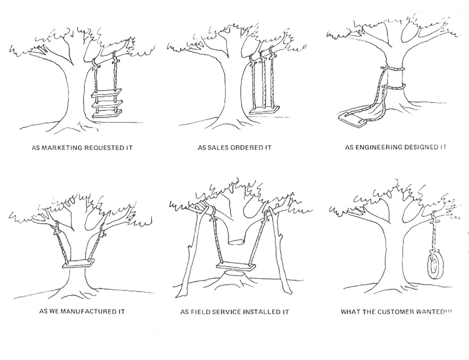
The infamous Swing Diagram *
Despite its pessimism—after all, people usually get these systems right in the end—the swing diagram does illustrate the problem of gathering and interpreting user requirements.
It all starts with the user requirements.
Traditionally an IT consultant would meet with the client and come away with a brief. For a data visualisation tool, typical requirements would include:
1. It shall work with our existing systems.
2. It shall be customisable.
And then someone powerful would say:
3. I want a dashboard that shows me [a list of reports that only they and their team really understand].
Here starts the to-ing and fro-ing where the users and consultants have endless meetings and stages of approval to arrive at a set of customer requirements. Some steps later, the consultant comes back with a non-functioning mock-up of the screens for client approval. More discussion follows, then coding, implementation, verification, and validation, with rounds of improvements and changes at each stage.
Imagine if the users could do some of it themselves
One of the best features of Power BI is not a functional feature at all. It is that customers can download the software themselves—it’s free to download and get started—install it easily, connect it to almost any data source, and start playing around with it.
The interface is so easy to use that it is almost counter-intuitive. Say you have a database of sales with the sale value, location of the sale, and sales person and you want to map the sales. It’s as easy as connecting to the data—an Excel spreadsheet, say—clicking the map icon, and clicking the field where the location is stored.
The procedure is similar for sales by salesperson: click the pie chart, click the value and name fields. Sales by region? Click the map, the sales value, and the region.
In small organisations with simple data, consultants may not be needed at all. And the organisation only needs to start buying licences when it has multiple users who want to use the software together, or to share what they have created.
By the time the consultant is involved, the prototype already exists
What this means for the consultant and client relationship is that the consultant gets involved much later in the development process. The client, or user, can build the interface (the dashboard) largely as they want to see it, and even build it with data behind it to make it work how they would like. At this point, they can get the consultant on-board to handle the complexities of connecting to live data, ironing out tricky wrinkles that the user hasn’t been able to work out, and making things work more efficiently.
For example, it is fair to say that Power BI will connect to almost any type of data source; there are nearly 100 in the import dropdown, including Dynamics 365, Salesforce, SurveyMonkey, Sybase, XML, Excel, Spark, Quickbooks, Github, and SAP. However, if you want to connect to some proprietary data sources—Hubspot springs to mind—you’ll need a consultant to build you a layer between the data and Power BI to make it work.
It’s fair to say that you can do a large amount of customisation of queries and data selection yourself, but a consultant is your best bet if you need to get down and dirty in some complex SQL queries or integrate with complex systems with multiple moving parts.
It’s about everyone playing to their strengths
Essentially, users can add value to Power BI in the way they do best: understanding and demonstrating how they want to use the tool. And the consultants can add value by picking up the project when the users have reached the limits of their ability, and take it to the next level.
At Professional Advantage we find that users are keen to use the training we can provide them, so they can get the best out of their Power BI. Once trained, our clients really embrace our hack days to push the boundaries of their thinking and what they can achieve. And when they need to sit down with one of our experienced consultants, there is enough knowledge on both sides of the table to make rapid and effective progress, and save money overall.
Why not find out more here, or download it now and have a play, and give us a call if you get stuck.
*This tree diagram is inspired by a similar diagram in Total Quality Management, by J Oakland, Heinemann, 1989, p11, and examples of the Swing Diagram have been around since the 1970s.